Interpretation of the MELD Graph pipeline results
This guideline explains how to interpret the MELD Graph results.
The main outputs of the MELD Graph algorithm are:
the MELD Graph PDF report
prediction.nii.gz (the cluster predictions for the whole brain)
lh.prediction.nii.gz and rh.prediction.nii.gz (the prediction masks for left and right hemispheres)
We recommend that users:
Interpret the MELD Graph PDF report
Visualise the predicted clusters superimposed on the T1 volume. This will enable:
Re-review of the T1 /FLAIR at the predicted cluster locations to see if an FCD can now be seen
Performing quality control
Here is a video tutorial on how to interpret the MELD Graph results: Interpretation tutorial.
Interpreting the MELD PDF report
The MELD pdf report and .png images of the predicted lesions are saved in the folder: /output/predictions_reports/<subject_id>/reports
The first page of the report provides an overview of all the predicted clusters on an inflated surface. E.g.
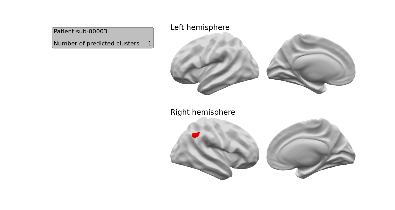
If you want to separately view this image, it is named inflatbrain_<subject_id>.png
Each of next pages of the report provides detailed information about 1 predicted cluster.
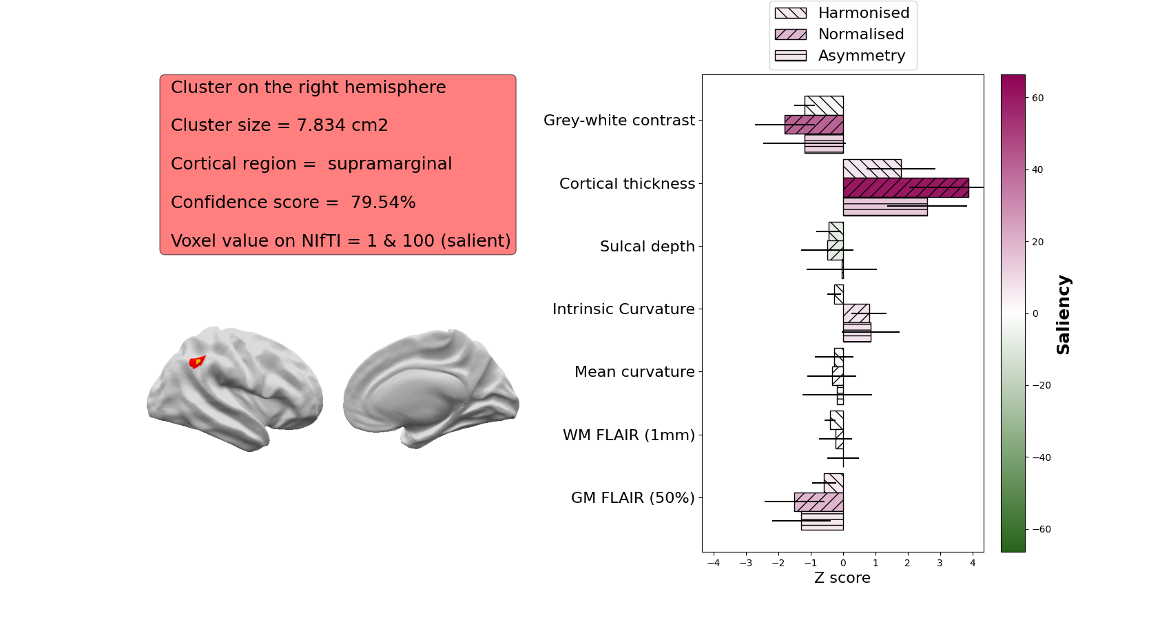
The following information is provided for each predicted cluster:
An image of the cluster on the volumetric T1 image (red) with the 20% most salient voxels (i.e. the voxels most important to the classifier’s decision) in orange
The hemisphere the cluster is on
The surface area of the cluster (across the cortical surface) in cm2
The cortical region in which the cluster mass centre is located
The confidence score of the predicted cluster (in %)
The integers values used to labelled this cluster and its salient vertices on the NIfTI prediction file.
The z-scores of the patient’s cortical features averaged within the cluster. In this example, the most abnormal features are the intrinsic curvature (folding measure) and the sulcal depth.
The saliency of each feature to the network - if a feature is brighter pink, that feature was more important to the network. In this example, the intrinsic curvature is most important to the network’s prediction
Viewing predicted clusters
For each predicted cluster, the prediction on the volumetric T1 image (red) with the 20% most salient voxels (i.e. the voxels most important to the classifier’s decision) in orange is displayed. Here is an example:
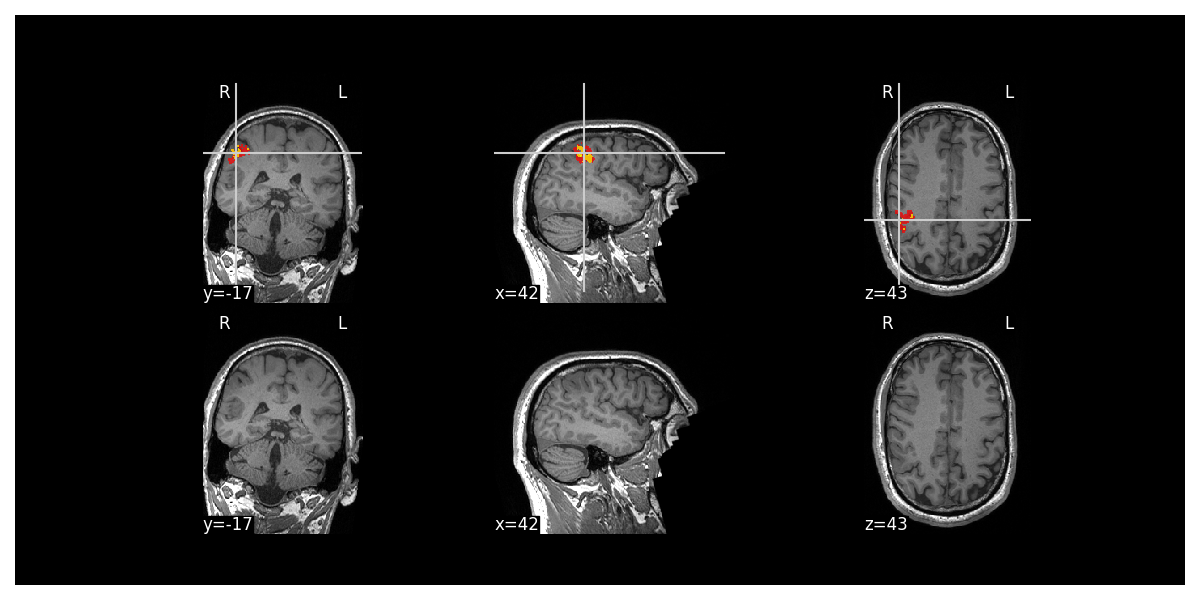
Each cluster has its own image e.g. mri_<subject_id>
Why did the classifier predict this area?
To understand more about the area predicted and why the classifier predicted this area, the report provides the following information:
The hemisphere the cluster is on
The surface area of the cluster (across the cortical surface) in cm2
The cortical region in which the cluster mass centre is located
The confidence score of the predicted cluster (in %)
The integers values used to labelled this cluster and its salient vertices on the NIfTI prediction file.
The z-scores of the patient’s cortical features averaged within the cluster. In this example, the most abnormal features are the intrinsic curvature (folding measure) and the sulcal depth.
The saliency of each feature to the network - if a feature is brighter pink, that feature was more important to the network. In this example, the intrinsic curvature is most important to the network’s prediction
We recommend that you carefully review all this information to underd more about the area predicted and why it was predicted. This will help you to decide whether the area identified is likely to be a FCD
For example:
The features that are included in the saliency image are:
Grey-white contrast: indicative of blurring at the grey-white matter boundary, lower z-scores indicate more blurring
Cortical thickness: higher z-scores indicate thicker cortex, lower z-scores indicate thinner cortex.
Sulcal depth: higher z-scores indicate deeper average sulcal depth within the cluster
Intrinsic curvature: a measure of cortical deformation that captures folding abnormalities in FCD. Lesions are usually characterised by high z-scores
WM FLAIR: FLAIR intensity sampled at 1mm below the grey-white matter boundary. Higher z-scores indicate relative FLAIR hyperintensity, lower z-scores indicate relative FLAIR hypointensity
GM FLAIR: FLAIR intensity sampled at 50% of the cortical thickness. Higher z-scores indicate relative FLAIR hyperintensity, lower z-scores indicate relative FLAIR hypointensity
Mean curvature: Similar to sulcal depth, this indicates whether a vertex is sulcal or gyral. Its utility is mainly in informing the classifier whether a training vertex is gyral or sulcal. Within FCD lesions, it is usually not characterised by high z-scores or high saliency.
If you only provide a T1 image, the FLAIR features will not be included in the saliency plot.
The information hereabove mentioned about each cluster are summarised into the csv file info_clusters_<subject_id>.csv
Viewing the predicted clusters on the T1 and quality control
After viewing the MELD PDF report, it is then important to visualise the predicted clusters on the T1 to see if they are likely FCDs or not.
The predictions are saved as NIFTI files in the folder: /output/predictions_reports/<subject_id>/predictions
It is important to check that the clusters detected are not due to obvious FreeSurfer reconstruction errors, scan artifacts etc.
Note: Docker does not allow GUI interface, therefore to run the QC you will need to have a stand alone installation of FreeSurfer/FreeView to enable the visualisation.
Open a terminal and cd to where you extracted the release zip.
You will need to first activate FreeSurfer
export FREESURFER_HOME=<freesurfer_installation_directory>
source $FREESURFER_HOME/SetUpFreeSurfer.sh
Then run the command:
python scripts/new_patient_pipeline/new_pt_qc_script_standalone.py -id <subject_id> -meld_data <path_to_meld_data_folder>
Open a terminal and cd to the meld graph folder.
You will need to first activate FreeSurfer
export FREESURFER_HOME=<freesurfer_installation_directory>
source $FREESURFER_HOME/SetUpFreeSurfer.sh
Then run the command:
./meldgraph.sh new_pt_qc_script.py -id <subject_id>
This will open FreeView and load the T1 and FLAIR (where available) volumes as well as the classifier predictions on the left and right hemispheres. It will also load the FreeSurfer pial and white surfaces. It should look like that:
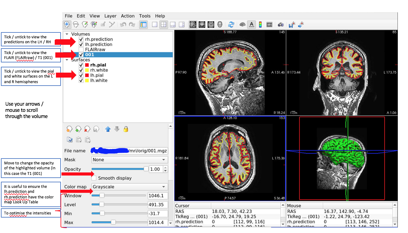
You can scroll through and find the predicted clusters.

Example of a predicted cluster (orange) on the right hemisphere. It is overlaid on a T1 image, with the right hemisphere pial and white surfaces visualised. Red arrows point to the cluster.
Things to check for each predicted cluster:
Are there any artifacts in the T1 or FLAIR data that could have caused the classifier to predict that area?
Check the .pial and .white surfaces at the locations of any predicted clusters. Are they following the grey-white matter boundary and pial surface? If not, you need to try and establish if this is just a reconstruction error or if the error is due to the presence of an FCD. If it is just an error or due to an artifact, exclude this prediction. If it is due to an FCD, be aware that the centroid / extent of the lesion may have been missed due to the reconstruction error and that some of the lesion may be adjacent to the predicted cluster.
Note: the classifier is only able to predict areas within the pial and white surfaces.
Limitations
Limitations to be aware of:
If there is a reconstruction error due to an FCD, the classifier will only be able to detect areas within the pial and white surfaces and may miss areas of the lesion that are not correctly segmented by FreeSurfer
There will be false positive clusters. You will need to look at the predicted clusters with an experienced radiologist to identify the significance of detected areas
The classifier has only been trained on FCD lesions and we do not have data on its ability to detect other pathologies e.g. DNET / ganglioglioma / polymicrogyria. As such, the research tool should only be applied to patients with FCD / suspected FCD
Performance of the classifier varies according to MRI field strength, data available (e.g. T1 or T1 and FLAIR) and histopathological subtype. For more details of how the classifier performs in different cohorts, see our paper.
Other commands
For native installation only: You can merge the MELD predictions onto the T1 nifti file using the command below. Note that you will need to have FSL installed on your machine.
./meldgraph.sh merge_predictions_t1.py -id <subject_id> -t1 <path_to_t1_nifti> -pred <path_to_meld_prediction_nifti> -output_dir <where_to_save_output>
The command will create the file predictions_merged_t1.nii.gz which corresponds to the predictions masks merged with T1 in RGB format. It can be viewed on RGB viewer or used to transfert on PACS system.
FAQs
Please see our FAQ page for common questions about the interpretation of outputs